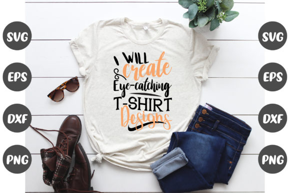
The composition of a work of art or design is the arrangement of its constituent parts in space, both in relation to one another and to the canvas upon which they are depicted. This time around, our canvas is a t-shirt, and since these garments aren’t exactly rectangular, the way you should go about arranging your composition will be influenced by the unconventional form of the shirt and the way it will be worn.
Both balance and a clear sense of structure are essential for any effective composition. What we mean when we talk about balance is that things are not stacked too heavily in any one direction. The importance of various parts of a design is ranked according to their hierarchy. Important text, such as a company name, should be bold and easy to read, while decorative elements and supporting text can be smaller and less noticeable.
When working with a rectangular canvas, you have the added benefit of a bounding box created by the canvas’s straight edges. T-shirts are very different because they are both a more complex shape and three-dimensional object that takes the shape of the body wearing it. Consequently, you can make your own bounding box to assist with the arrangement of your design and ensure that everything looks right.
You’ve probably seen many examples of this technique being used in t-shirt design placement guides, and it’s one of the main reasons why such designs tend to have a certain aesthetic. Using a background shape that encompasses and emphasizes your design elements is one easy method for accomplishing this. To illustrate the point, let’s dissect a sample design.
Forming the background with shapes
You can see how using simple background shapes can help you make sense of the composition and give all the elements a place to sit in the sample design for our brewery category down below.
Placing a few pieces of text, such as a company name, location, and year, all over a blank t-shirt can make it look like the words are just floating there. This circular background shape is the perfect solution because it not only provides a nice bounding box for the print but also allocates specific locations for each of these textual components.
It’s a nice, understated way to spice up the design with a little extra flair. People often start designing with an idea of what text they want to include, but fail to recognize the importance of including a few basic geometric shapes to make the design feel whole. The simplicity of this layout is impressive. It’s made up mostly of text blocks, a single image, and some grounding and organizing circles and lines.
As you can see, this method of enclosing the elements within a sizable form is extremely common, and it’s not restricted to circles. The below layout is based on one of our family trip templates and is constructed in the same way.
The primary content is highlighted and given a box to rest in by the banner at the top of the page. To ensure that the mountains, cacti, and other elements of the illustration aren’t just floating around the t-shirt, a window-like outline surrounds the central design. There is a slight variation in that not everything must fall within this range of possibilities.
The text at the design’s bottom is a reflection of the text at the design’s top, maintaining a sense of equilibrium. The other, smaller textual elements can be seen in the empty space between the window’s panes. Even so, it’s not hard to picture a rectangular bounding box, invisible to the naked eye, on the shirt’s front, collapsing all these components into neat little clusters.
Placement of elements in a pyramid
Composing attractively does not always necessitate employing a shape that contains the design elements. Instead, the same effect can be achieved by stacking and grouping elements, while simultaneously emphasizing their individual significance.
The below layout, taken from our Greek design templates, exemplifies how stacking even a small number of elements can produce a design that is not only balanced but also has a clear hierarchy that establishes a point of emphasis.
The floral illustration in the background is purely decorative, but it serves the same purpose as the geometric shapes did before. It creates a visual boundary around the stacked text elements, making them feel less like they’re floating in space and allowing you to visualize their bounding box.
Further, everything is proportioned and laid out so that the most crucial information stands out. The most crucial information, presented in big, bold letters at the shirt’s visual center, is unmistakable. The secondary text elements are then either reduced in size or rendered in a color that blends less obviously with the t-background, and shirts and is situated lower and off-center.
Following these guidelines, you should be able to create a well-balanced, attention-grabbing t-shirt design
-
Designs that are symmetrical are a safe bet
Even if your design isn’t symmetrical, it can still feel balanced, but it simplifies things and design placement on the front of the shirt always looks good on a t-shirt.
-
Use size and placement to create a main point of interest
The most important part of your design should stand out more than the rest, and it’s best to put it on the chest or wherever the visual center is. And make sure that the other parts are clear second choices.
Don’t make things too hard
The more parts you add to your design, the harder it will be to put them together in a good way. The best designs are often the simplest ones, and if you add too many things, it can feel cluttered and lose its focus.
The simpler the design should be, the smaller it is
If you’re making a design for something as small as a left chest, you won’t have as much space to put in a lot of different parts. Because of this, logos or names are usually all that is used for small places like this. When you try to fit too much into a small space, the design can become hard to read and may even be impossible to print.

